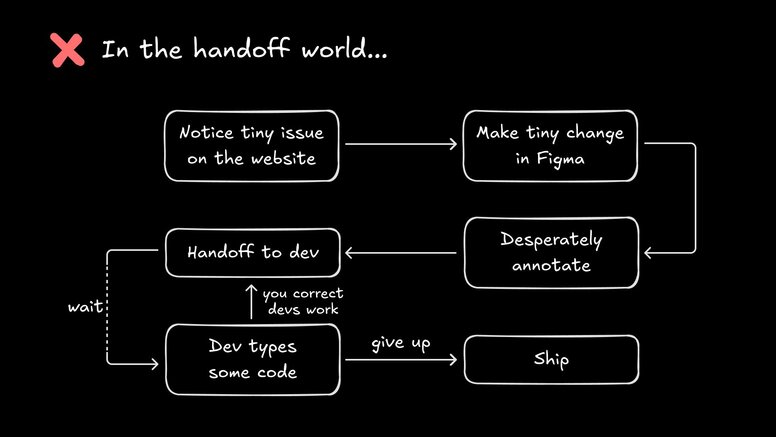
Ever notice how a quick margin tweak can turn into a multi-day opera of Slack threads, Figma comments, and “can-you-bump-the-PR” reminders?
Design handoff has always been a necessary evil of building on the web, the price you pay for getting pixels from “looking right” in Figma to “being real” in production.
But lately, it feels wrong. Why does nudging a button five pixels feel just as difficult as shipping an entirely new feature? Why does the artifact overhead—files, specs, prototypes, annotations—end up outnumbering the changes you actually wanted to make?
Let’s talk about what happens when you stop prepping for the work and just get to do it.
For a lot of designers, “designing” means wrangling files, not pixels.
You change a button radius, leave a note. A PM starts a thread. Devs do their best interpretation in code, and now you’re trading screenshots of prod vs. the mockup to track down where the line got lost in translation.
Meanwhile, the Figma file and production code drift apart, and the source of truth getting fuzzier every sprint. Half your creative energy gets chewed up waiting for others and correcting their interpretations of your perfect design.

It’s an awful lot of hubbub for a few pixels. Handoff has somehow morphed from a single phase into a perpetual feedback cycle.
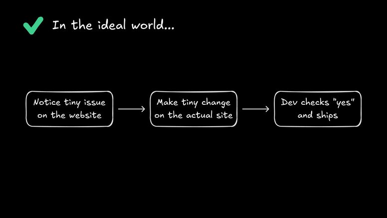
Wouldn’t it be nice if, instead of prepping a parade of artifacts, you could just open up the actual product, make the change right on the page, and move on—without worrying about breaking prod or learning React?

Imagine skipping the “can you make this 4px bigger” DMs and just sending your dev team a clean diff, ready for review, all while staying firmly in your designer lane.
Time to run a little experiment to try it out.
Let’s say you’re looking at your own product—live, no Figma tab in sight. The logo’s a little too close to the nav. The call-to-action color looks off-brand. Old you would file a ticket, annotate the delta in five Slack messages, then cross your fingers that it doesn’t get garbled on its journey from design to prod.
Fusion flips this on its head.
First, open the page in Fusion’s visual editor. No digging through prod code, no gatekeeping. Once you click “New Branch,” you’ve got your own safe sandbox, free from dev bottlenecks. Here, you can use “Design” mode to make any visual changes you’d like, or you can prompt the AI with contextual awareness of your selection.
Then, start small. Maybe you tweak that button color to the exact hex on your brand palette, or change some font sizes for better information hierarchy. You’re seeing those changes live on the actual page, not a simulation.
Now, let’s get bolder. Maybe you want to nudge a few components into better alignment, adjust some padding, or even rearrange the order of components.
Every tweak is visual, instant, and happening right where users will see it. Instead of prepping a doc, you’re shaping the real thing. When you apply a change to one instance of a component, Fusion applies that change to all synced components.
And when you’re finished with your tweaks, you can click “Submit PR” to hand off the generated code to your devs, right in GitHub.
Fusion always keeps prod safe. Branches act as your personal safety net—nothing you do ships until a developer reviews and approves it. Every change gets tracked, so your team can always double-check exactly what’s different, just like you’d review changes in Figma.
That’s the point: you don’t have to. Fusion does the heavy lifting behind the scenes, and your font size nudge automatically becomes the right CSS or Tailwind class. Your focus stays on design, not deciphering commit diffs.
Only if you try renaming all their variables “ButtonyMcButtonFace.” The reality is, most developers are more than happy to let designers fine-tune the interface while they focus on the fun stuff: logic, architecture, performance.
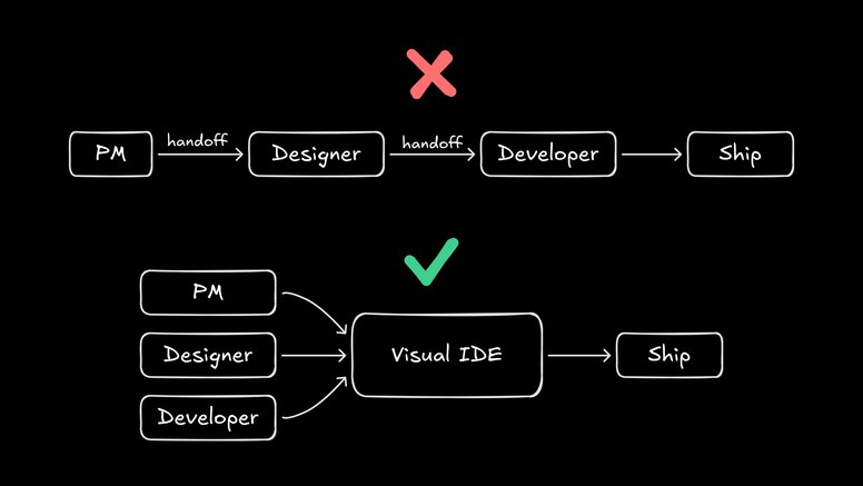
This isn’t replacement, it’s collaboration. Devs review and merge, and you both get to spend less time explaining and more time building.
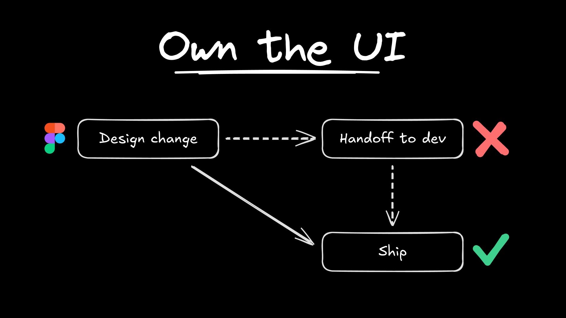
With Fusion, you skip the mockup juggling entirely. The only thing you hand off is a small, focused change, ready for review in the real repo. Designers stay designers. Developers stay developers (and are less swamped dealing with 4px nudges). Everybody wins.
Of course, sometimes you need to go a little bigger than moving things around on the page. Maybe marketing wants a total homepage refresh, or you’re exploring a wild new layout that nobody’s seen before. This is where Figma enters the chat.
Fusion’s secret weapon is its round-trip workflow with Figma. Here’s the gist:
You grab any part of your product, from a single card to the whole page, and export it straight into Figma.
Now you’re back on your home turf: snapping things to grids, running spacings through the Design Police, or cycling through twenty header styles until the vibe is immaculate. Maybe it’s a collaborative jam session—stakeholders can comment, another designer riffs on your layout, or you just want to see the wildest version before shipping anything real.
Then, when you’re happy, you pull the changes from Figma right back into Fusion.
In the above instance, I haven’t applied auto layouts, but you’ll get even better results from Fusion if you do.
Whether you’re designing in Figma from scratch or from exported code, Fusion uses your team’s existing design tokens and components, so everything stays visually clean. Your crisp new design lands in the actual codebase, easy for devs to finish implementing.
Let’s zoom in on a typical week at Builder’s own product design team. One of our designers is poking around the live product—maybe QA-obsessing, maybe just low-key tired of seeing a card description ride a little too close to its border.
Instead of firing off a Slack message (and then quietly dreading how long it’ll take to see the fix), she opens the page in Fusion. New branch, no drama. Visual editor up. She nudges the padding up 8px. Color looks off? She fixes that, too. The preview updates instantly, right where customers will see it (once a dev approves the changes).
And then comes the handoff, if you can even call it that anymore. She submits a pull request. The diff? A single line of code, swapping py-2 for py-4 or color-green-400 for color-green-300.
Atomic design edits mean the PR is tiny, focused, and trivial to review. Developers don’t have to reverse-engineer intent or sort through a pile of speculative Figma comments. They see exactly what changed and why. Every tweak lives safely on a branch, with visible diffs and a human in the loop before anything hits prod.
No more “heyyy sorry to ping about this again,” nothing lost in translation, and nobody’s left cleaning up after another long day prototyping. Instead, what used to be an ornamental, administrative slog now feels like real product stewardship, where everyone can contribute on the same canvas.

Designers stop being spec-creators and get to become bona fide builders who experiment, ship, and solve pain points right in the flow of work, seeing their choices go live at the speed of their curiosity.
Designers didn’t sign up to be professional annotators or workflow diplomats; they signed up to make great products.
This isn’t about skipping collaboration or side-stepping developers. It’s about moving faster together, with less friction in the handoff and way more ownership at every step. As workflows keep evolving, the teams that thrive will be the ones where designers get to do what they do best: spot problems, fix them, and ship beautiful things—no handoff required.
Fusion puts the power (and the fun) back in designers’ hands, letting them spend less time prepping and more time actually in the craft.
Builder.io visually edits code, uses your design system, and sends pull requests.
Builder.io visually edits code, uses your design system, and sends pull requests.


 Connect a Repo


