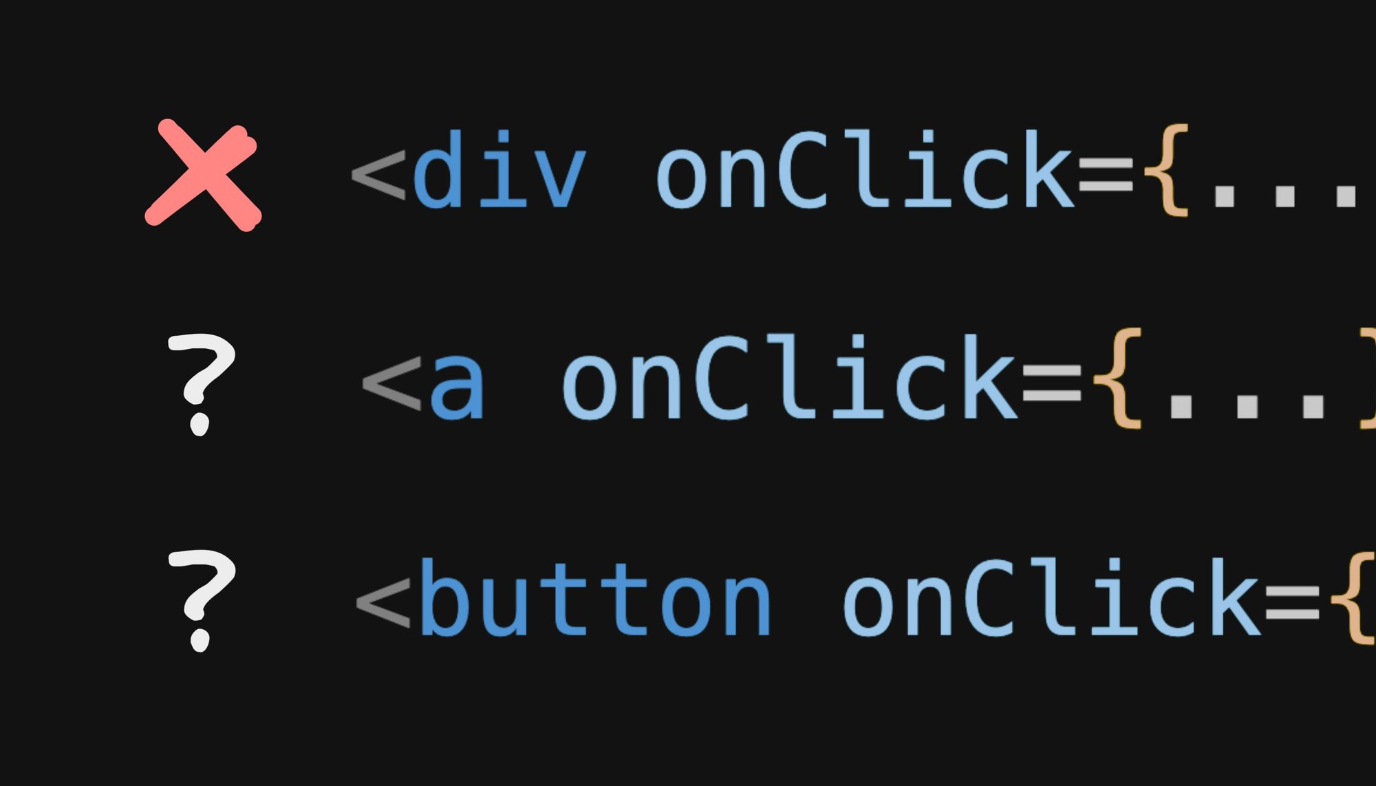
So you use an anchor tag, a button tag, or something else entirely (a div??) for clickable elements in HTML?
// 🚩
export function MyButton() {
  return <div onClick={...}>Click me</div>
}
//❓
export function MyButton() {
  return <button onClick={...}>Click me</button>
}
//❓
export function MyButton() {
  return <a onClick={...}>Click me</a>
}
The answer is surprisingly nuanced, and some of it might surprise you.
Let’s start by making one thing clear — you should not use a div for a clickable element (at least in 99% of cases). But why?
Simply put, a div != a button. A div is simply a generic container, and is missing a number of qualities that a properly clickable element should have, such as:
- Divs are not focusable, for instance, your
tabkey will not focus a div as it will for any other button on your device. - Screen readers and other assistive devices don’t recognize divs as clickable elements.
- Divs do not translate certain key inputs, like space bars or return keys, to clicks when focused.
Now, you can work around some of these issues with a few attributes like tabindex="0" and role=”button”:
// 🚩 Trying to make a div *mostly* behave like a button...
export function MyButton() {
  function onClick() { ... }
  return (
    <div
      className="my-button"
      tabindex="0" // Makes the div focusable
      role="button" // Hint to screen readers this is clickable
      onClick={onClick}
      onKeydown={(event) => {
        // Listen to the enter and space keys when focused and call the
        // click handler manually
        if (event.key === "Enter" || event.key === "Space") {
          onClick()
        }
      }}
    >
      Click me
    </div>
  )
}
Oh yeah, and we need to make sure to style the focused state so there is user feedback that this element was focused too. And we must make sure this passes all accessibility concerns, like:
.my-button:focus-visible {
  outline: 1px solid blue;
}
This is becoming a lot of work to try and chase down all of the nuanced, but critical, behaviors of buttons and implement it all manually.
But we’re in luck because there is a better way (most of the time)!
The beauty of the button tag is it behaves just like any other button on your device, and is exactly what users and accessibility tools expect.
It is focusable, accessible, keyboard inputable, has compliant focus state styling, the works!
// ✅
export function MyButton() {
  return (
    <button onClick={...}>
      Click me
    </button>
  )
}
But, buttons come with a couple problems we need to be aware of.
The biggest annoyance I’ve always had with buttons is styling them.
For instance, if you simply want to give a button a nice light purple background:
<button class="my-button">
  Click me
</button>
<style>
  /* 🤢 */
  .my-button {
    background-color: purple;
  }
</style>
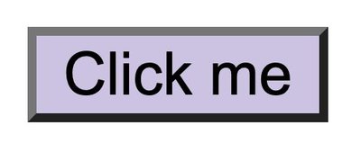
You will end up with this atrocity:

That looks right out of Windows 95.
Yes, browsers try to force all kinds of weird styling to button elements and applying your own styles just makes a mess.
This is why we all love divs. They come with no added styling or behavioral baggage. They work and look exactly as expected, every time.
Now you could say, oh! appearance: none will reset the appearance! But no, that does not quite do what you think.
<button class="my-button">
  Click me
</button>
<style>
  .my-button {
    appearance: none; /* 🤔 */
    background-color: purple;
  }
</style>
Our monster still remains:

That’s right, we have to actually reset properties line by line:
/* ✅ */
button {
  padding: 0;
  border: none;
  outline: none;
  font: inherit;
  color: inherit;
  background: none
}
This will now finally give us a button that looks and behaves like a div, with one additional benefit that it still uses the browsers default focus styling.
An alternative option you have is to use all: unset to get back to no special styling in one simple property:
/* ✅ */
button { all: unset; }
button:focus-visible { outline: 1px solid var(--your-color); }
Just don’t forget to add your own focus state; for example, an outline with your brand color with sufficient contrast — and you’re good.
There is one last issue to be aware of when using the button tag. Any button inside of a form by default is treated as a submit button, and when clicked will submit the form. What??
function MyForm() {
  return (
    <form onSubmit={...}>
      ...
      <button type="submit">Submit</button>
      {/* 🚩 Clicking "Cancel" will also submit the form! */}
      <button onClick={...}>Cancel</button>
    </form>
  )
}
That’s right, the default type attribute for buttons is submit. Yeah, it’s weird. And annoying.
To fix this, unless your button actually is meant to submit a form, always add type="button" to it, like so:
export function MyButton() {
  return (
    <button
      type="button" // ✅
      onClick={...}>
       Click me
    </button>
  )
}
And now our buttons will no longer attempt to find their closest form parent and submit it. Whew, that almost got weird.
Here is the one big exception to our rule. We do not want to use buttons for links to other pages:
// 🚩
function MyLink() {
  return (
    <button
      type="button"
      onClick={() => {
        location.href = "/"
      }}
    >
      Don't do this
    </button>
  )
}
A few problems with buttons that use click events to link to pages:
- They are not crawlable, so are very bad for SEO.
- Users cannot open this link in new tabs or windows; for example, with
cmd/ctrl-click, right-click “open in new tab”.
As a result, let’s not use buttons for navigation. That’s where we want our trusty a tag.
// ✅
function MyLink() {
  return (
    <a href="/">
      Do this for links
    </button>
  )
}
And the best part is that they have all of the above-mentioned benefits of buttons — accessible, focusable, keyboard inputtable — and they don’t come with a bunch of funky styling!
But, before you say waaait, if an a has the benefits of a button, without all the funky styling, should we not just use them for anything clickable and save ourselves some headaches?
// 🚩
function MyButton() {
  return (
    <a onClick={...}>
      Do this for links
    </a>
  )
}
Well, no. That’s because an a tag without an href no longer behaves like a button. That’s right, it only has the full button behaviors, such as being focusable, when it also has an href with a value.
So, let’s be sure to stick to buttons for buttons, and anchors for links.
One pattern I quite like is to encapsulate these rules in a component, so you can just use your MyButton component and if you provide a URL, it becomes a link, otherwise is a button, like so:
// ✅
function MyButton(props) {
  if (props.href) {
    return <a className="my-button" {...props} />
  }
  return <button type="button" className="my-button" {...props} />
}

// Renders an <a href="/">
<MyButton href="/">Click me</MyButton>

// Renders a <button type="button">
<MyButton onClick={...}>Click me</MyButton>
This way, we can have a consistent developer experience and user experience, regardless of if the purpose of the button is a click handler or a link to another page.
And, to top things off, let's add some types as well:
type AnchorProps = React.AnchorHTMLAttributes<HTMLElement>
type ButtonProps = React.ButtonHTMLAttributes<HTMLElement>
type MyButtonProps = AnchorProps | ButtonProps

function isAnchor(props: MyButtonProps): props is AnchorProps {
  return (props as AnchorProps).href !== undefined
}

export function MyButton(props: MyButtonProps) {
  if (isAnchor(props)) {
    return <a className="my-button" {...props} />
  }
  return <button type="button" className="my-button" {...props} />
}Ok, that was a lot! In short: for links, use an anchor tag with the href property, for all other buttons use the button tag with type="button".
Hi! I'm Steve, CEO of Builder.io.
We make a way to drag + drop with your components to create pages and other CMS content on your site or app, visually.
You may find it interesting or useful:
Builder.io visually edits code, uses your design system, and sends pull requests.
Builder.io visually edits code, uses your design system, and sends pull requests.


 Connect a Repo


